Designing a new customizer feature from end-to-end
Luca+Danni is an east coast jewelry brand with a growing in store and online presence. Specializing in handcrafted pieces, such as bangle bracelets, necklaces and earrings, they were looking for help with improving their website’s user experience (UX) and eCommerce conversion rate (CVR).
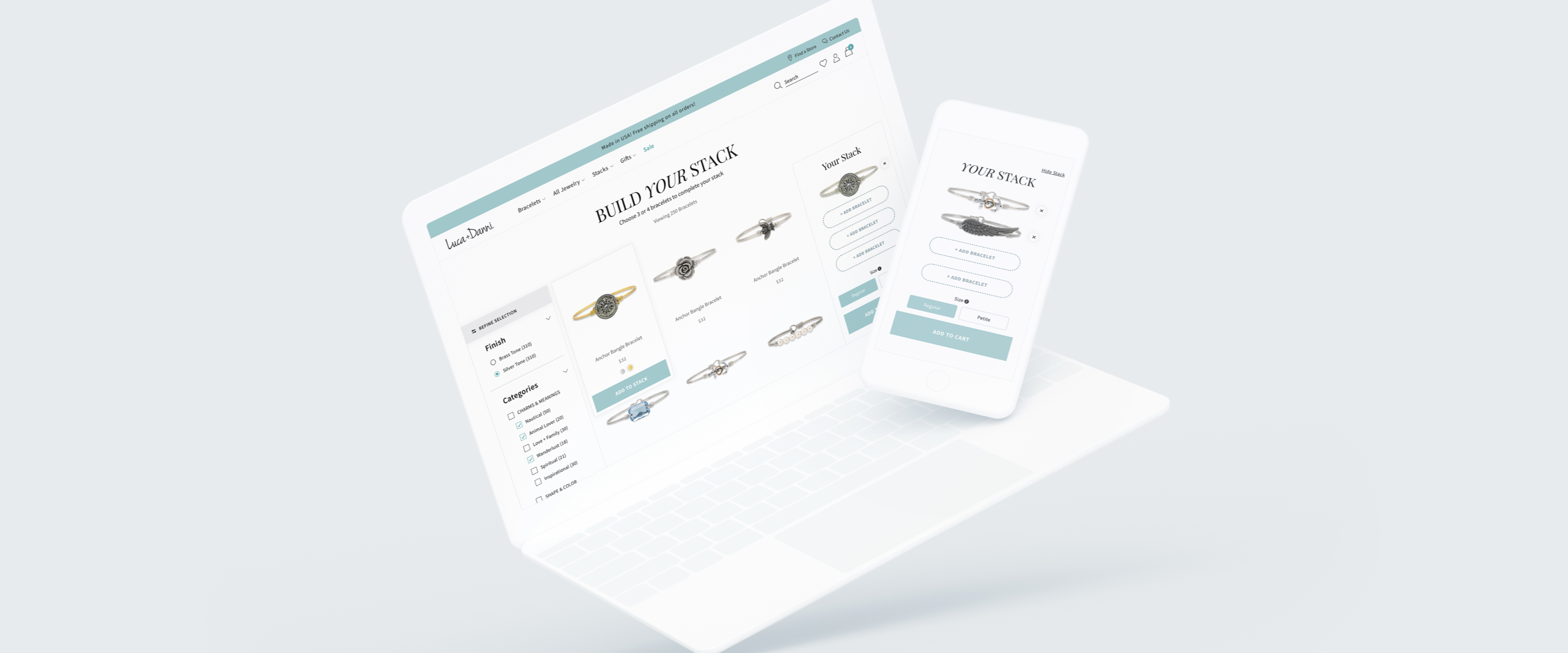
The Ask: Help increase average order value (AOV) by building a "Build Your Stack" feature.
The Result: Created a new feature where users could browse, pick and choose multiple bracelets to purchase for a discounted rate. Within the first month of launch, AOV increased by +13%.
MY RESPONSIBILITIES
UX Design, UI Design
TOOLS USED
Sketch, Abstract, InVision
Understanding the Problem
Luca+Danni was a "small retainer client," meaning there were only a handful of hours dedicated to design per month. Initial meetings with the client were important to not only understand the business goals, but to gather insights on (1) their product catalog, (2) their fulfillment process, (3) current user shopping behavior, and (4) marketing strategy. By better understanding these core concepts of their business, I was able to start a list of feature and user requirements.
Our Approach*
*Created with considerations to project timeline and budget.
Conduct a competitive analysis to identify advantages and disadvantages within a customizer feature.
Sketch wireframes and user flows to help brainstorm ideas and communicate designs to the internal team and client.
Design a high fidelity prototype to establish design components for final client approval and development.
Understanding the Competition
To help guide the design process, a competitive analysis was done with both direct and indirect competitors. Direct competitors were chosen for their similarities in product offering, while indirect competitors were chosen for their unique interfaces and ability to select multiple variants.
Goals for the competitive analysis were:
(1) Know the strengths and weaknesses of the competition
(2) Identify any advantages and disadvantages of the feature
(3) Have evidence to back up any design decisions
(4) To help solve and/or avoid possible usability issues.
DIRECT COMPETITORS

INDIRECT COMPETITORS

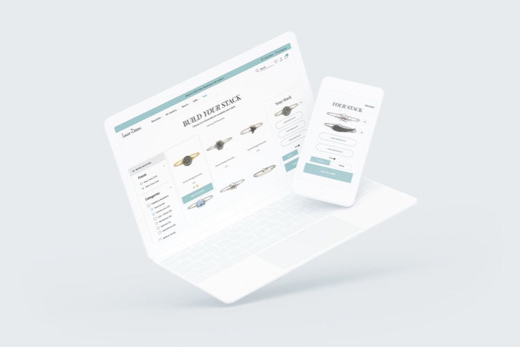
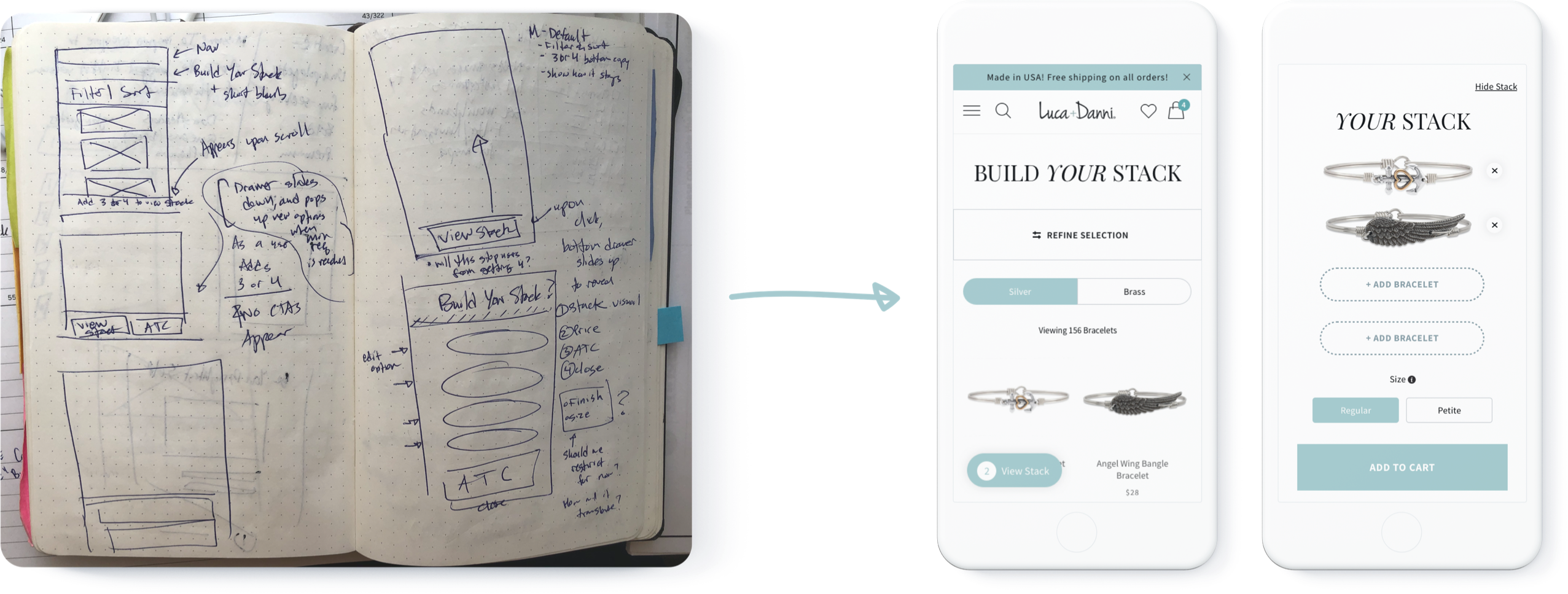
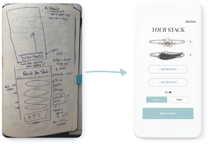
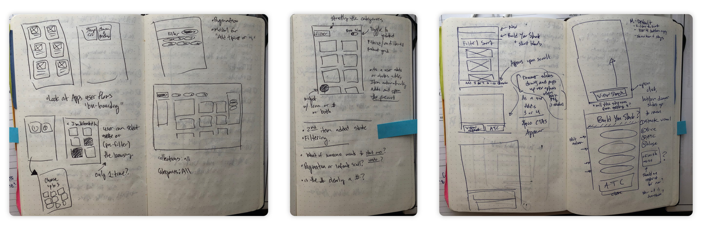
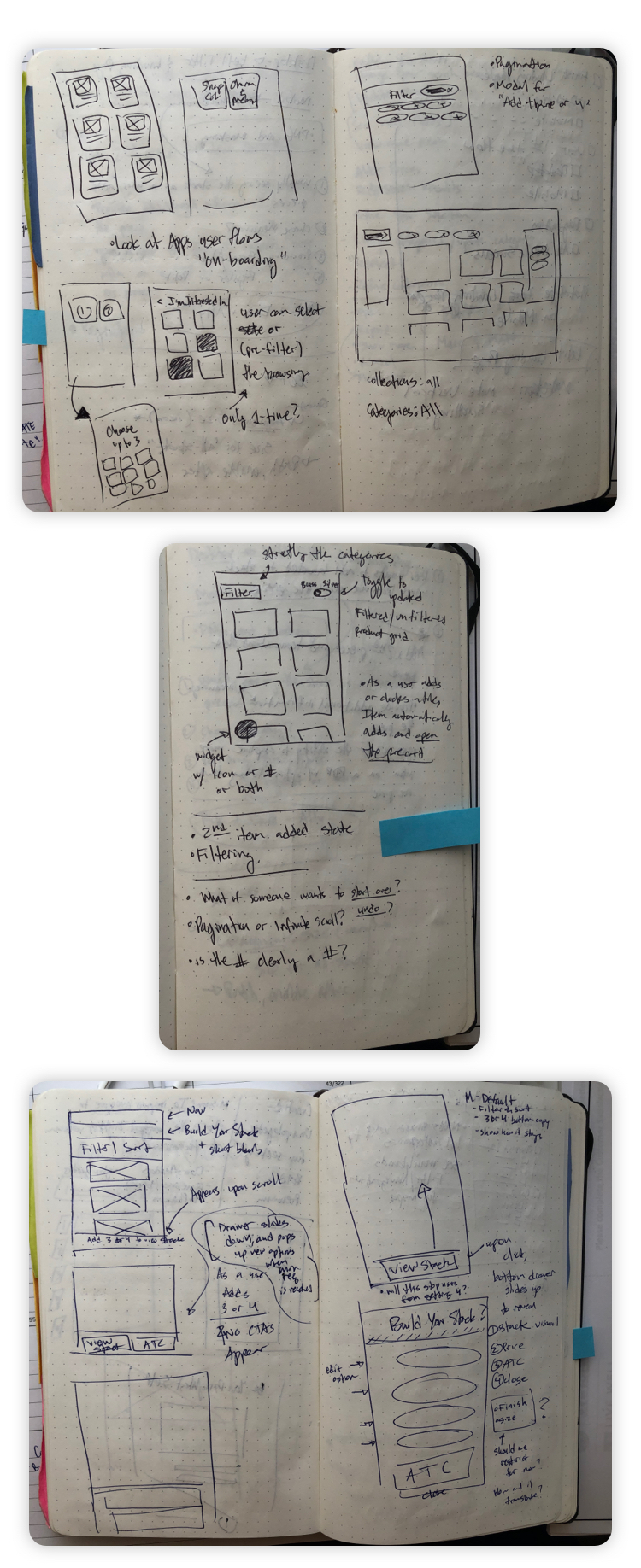
From Sketches to Wireframes
Using the findings from the initial client meetings and competitive analysis, I started to sketch out possible layout designs of the necessary features. Not worrying too much about the final visual design at this point in the process, I focused my efforts on composition, usability, and user flow of the “Build Your Stack" feature. Wireframes were later done in mid to high fidelity for the sake of saving time and effort.
EARLY SKETCHES
USER FLOWS
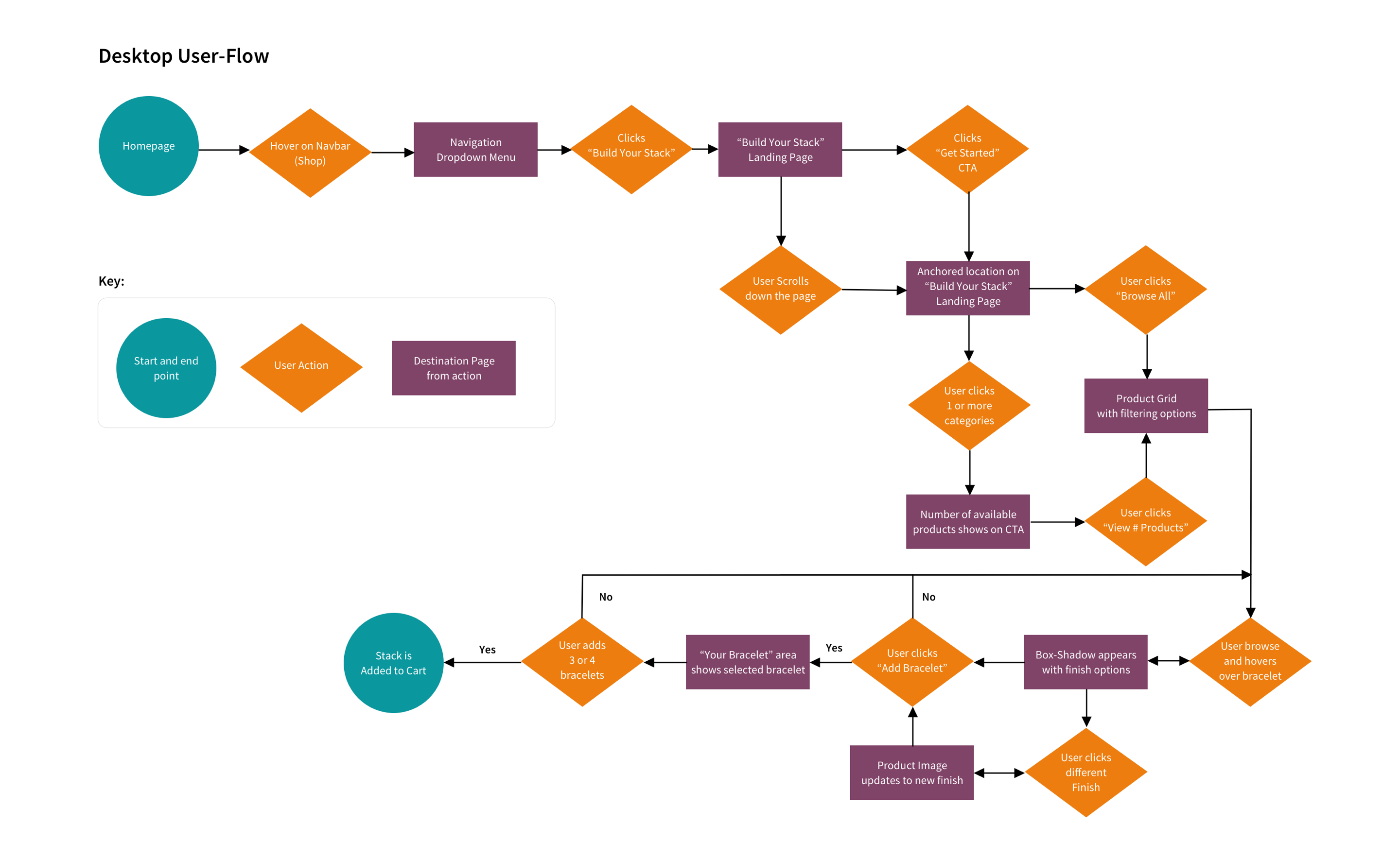
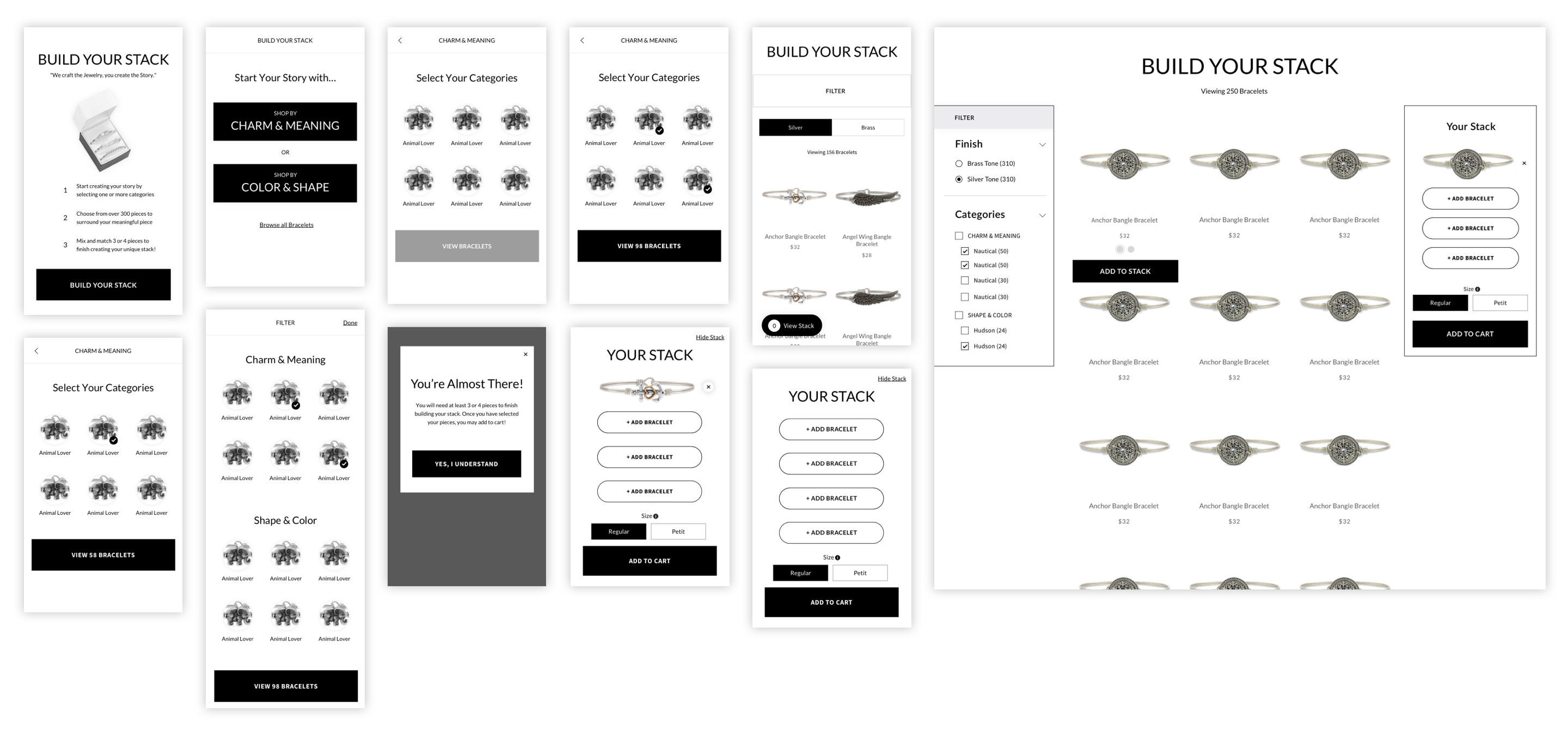
WIREFRAMES
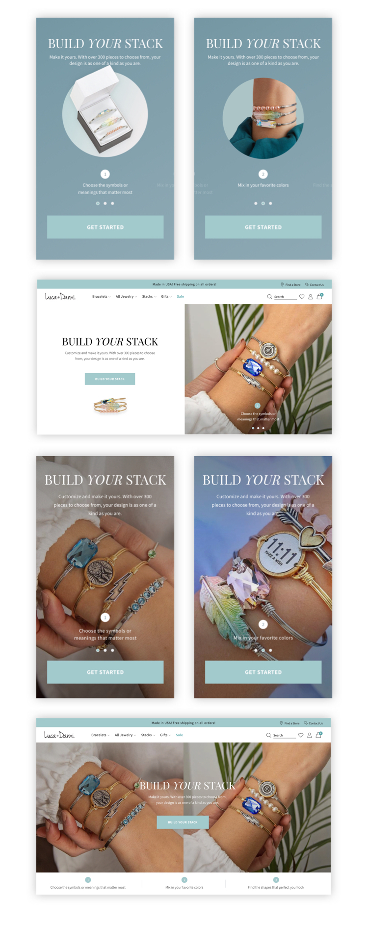
Educating L+D Users
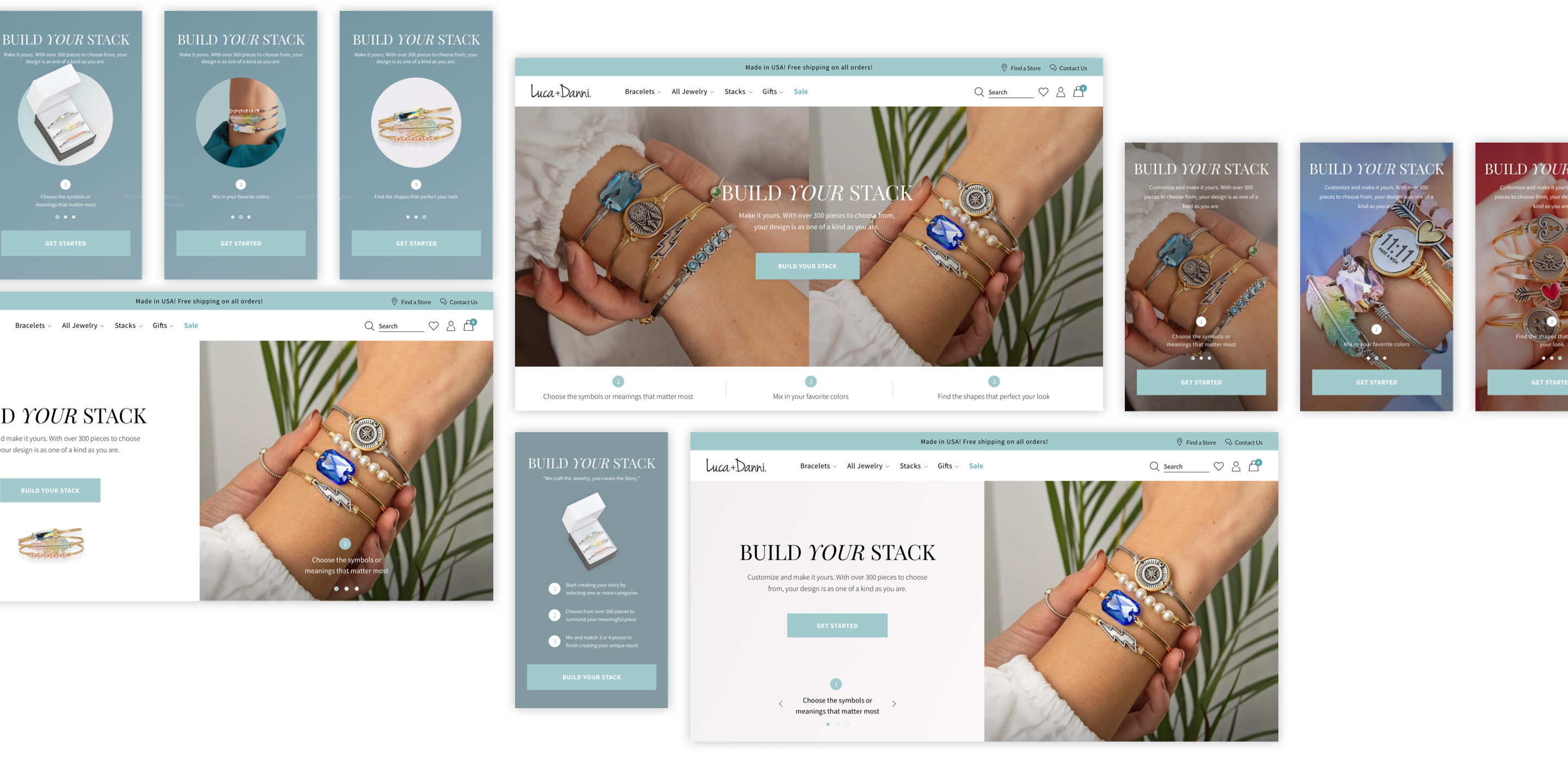
One key element that was iterated on before launch was the idea of educating customers to “Build Your Stack.” Strategies to inform and incentivize users included (1) a homepage section promoting the new feature, (2) primary location in the header navigation, (3) notification within the promo bar, and (4) an email campaign.
Partnering with Luca+Danni’s marketing team, we chose to create a landing page that generated a unique URL to help drive traffic to “Build Your Stack.” With new users experiencing Luca+Danni's brand for the first time with this feature, I explored a few designs to help incentivize user interaction. Each option had their pros and cons, but eventually agreed that showing lifestyle images paired with instructional information was the best option.
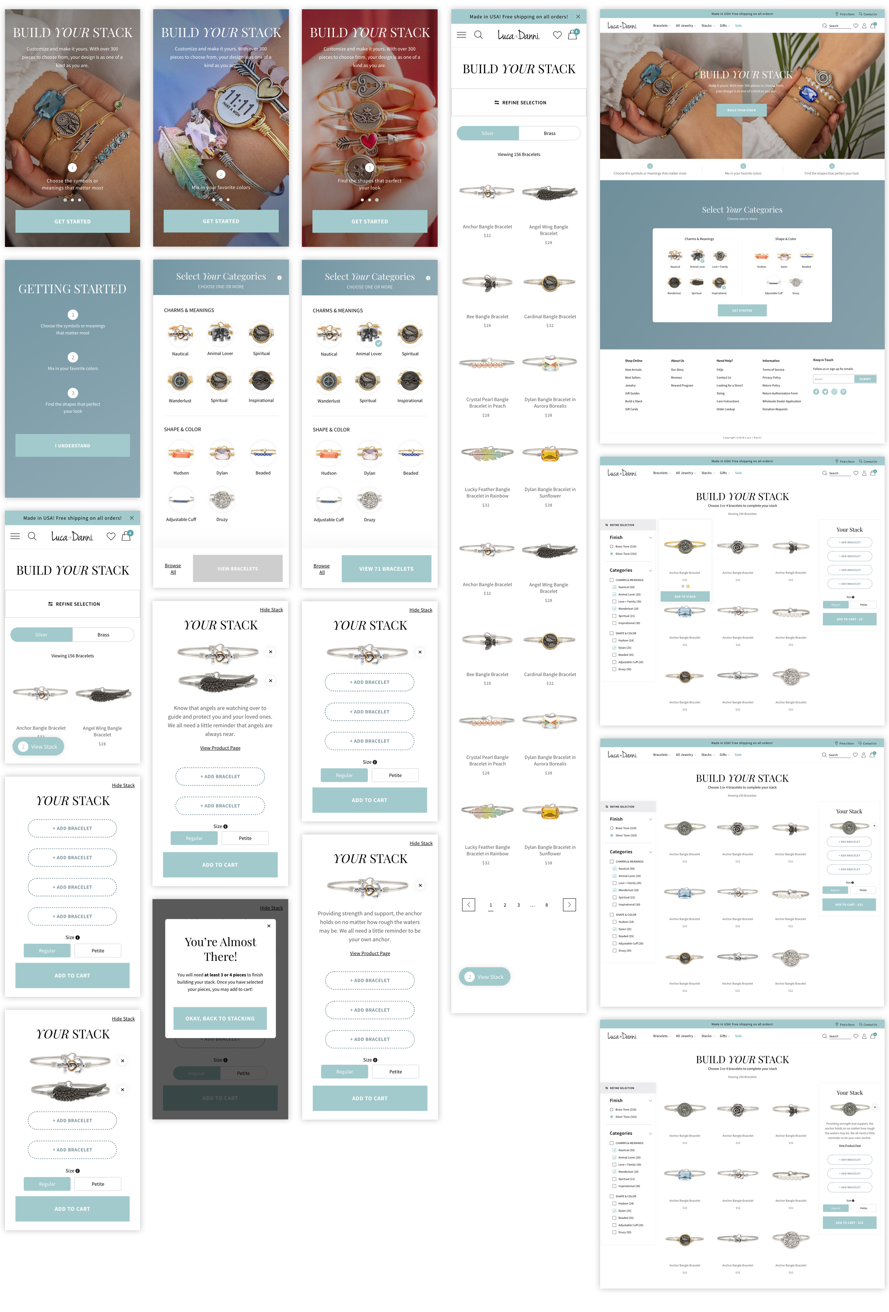
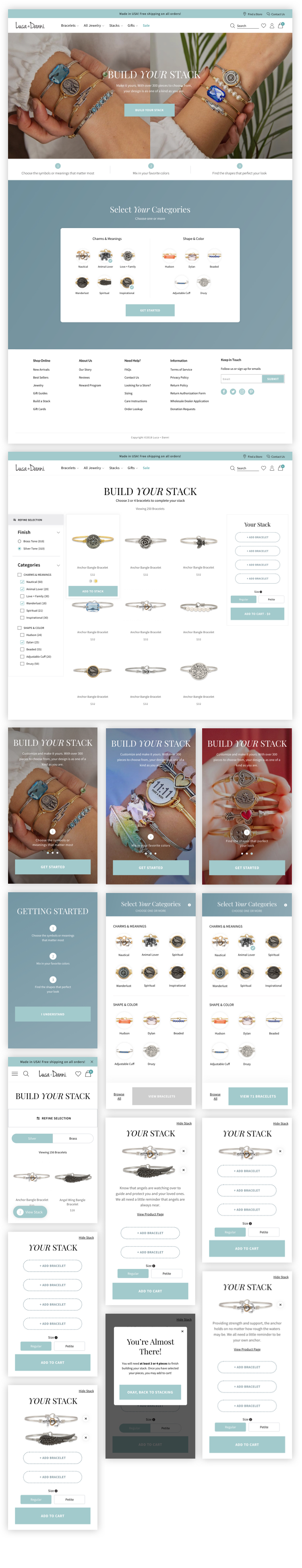
Helping users as they shop
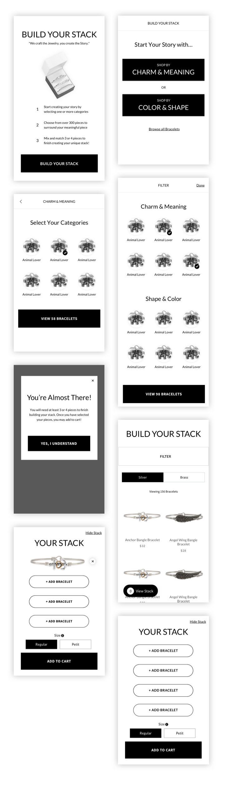
It was very important to have areas on screen where information was readily available and/or accessible. I added a few UX and UI elements within the design to help inform and navigate users through this new feature/experience. For example, descriptive copy were either shown on page load or could be accessed through tapping or clicking an info icon. Additionally, a system requirement was implemented where any category or bracelet selections would automatically be saved if a user would happen to exit “Build Your Stack” for any reason. This was introduced to alleviate any user frustrations on lost progress. A list of more helpful UX/UI elements can be found below.
Helpful UX/UI Elements
Landing page design incorporated lifestyle imagery of the final product paired with helpful information on what to expect.
A dynamic CTA where the number of products appeared within the button as a user selected categories. This pre-filter experience helped users know how many products are expected to see on the next screen.
Exposed bracelet finish options on mobile and desktop. By interacting with a radio button on desktop or a fixed button on mobile, users could quickly swap all images within the product grid with their preferred bracelet finish.
"View stack” widget on mobile informed users on how many bracelets were in their stack at any time. This widget also allowed for more screen availability for the product grid/user browsing.
Final Design & Results
By the end of the project, I successfully conceptualized and designed a new feature that met our business, user, and system requirements. Within the allocated timeline and budget, I conducted a competitive analysis with indirect and direct competitors, sketched wireframes and user flows, and designed mid to high fidelity mockups for a functioning prototype using Sketch and InVision. As a result, within the first month of launch, AOV increased by +13% for Luca+Danni.
Learnings
THE NEED FOR FLEXIBILITY
Not all projects have the luxury of a large budget or extra time for UX discovery. Luca+Danni was the perfect example of needing to adapt and rationalize which research method was necessary to move forward with design. Yes, creating user personas and journey maps would have assisted me in making a more tailored experience, but the competitive analysis was more than enough to complete a MVP of this new feature.
ENCOURAGE FOLLOW UP TESTING
Luca+Danni’s "Build a Stack" was one of my first design projects where I had to ideate and design a new feature from end-to-end. Due to a limited budget and short timeline, not all of the styles and functionality made it to the final product. If done again, I would focus on an MVP and carve some time and budget in the later months for follow up user testing. It may not seem worthwhile to the client upfront, but I believe in doing so, we would find more opportunities for increasing AOV and CVR.
Credits
AGENCY
BVA
YEAR
2018/2019
PRODUCER
Margaret Odisho
ECOMMERCE STRATEGIST
Taylor Elliot
FRONT-END DEVELOPER
Kyle Villanueva