
Thrive Causemetics
BVA - Testing a new mobile shopping experience for increased conversion
Thrive Causemetics is a direct-to-consumer cosmetics brand focused on makeup and skincare. With a new line of products set to launch for the following year, their team wanted us to see if there were any UX or UI improvements to their Sets Product Details Page (PDP).
After a discovery and design phase, I tested a new purchasing user flow using InVision and userlytics.com. With the results, I iterated and improved the design which led to a +44% eCommerce conversion rate.
Year
2019/2020
Timeline
8 Weeks
Role
UX Designer, UI Designer
Tools
Sketch, Abstract, InVision, Google Analytics, Userlytics
Understanding the Problem
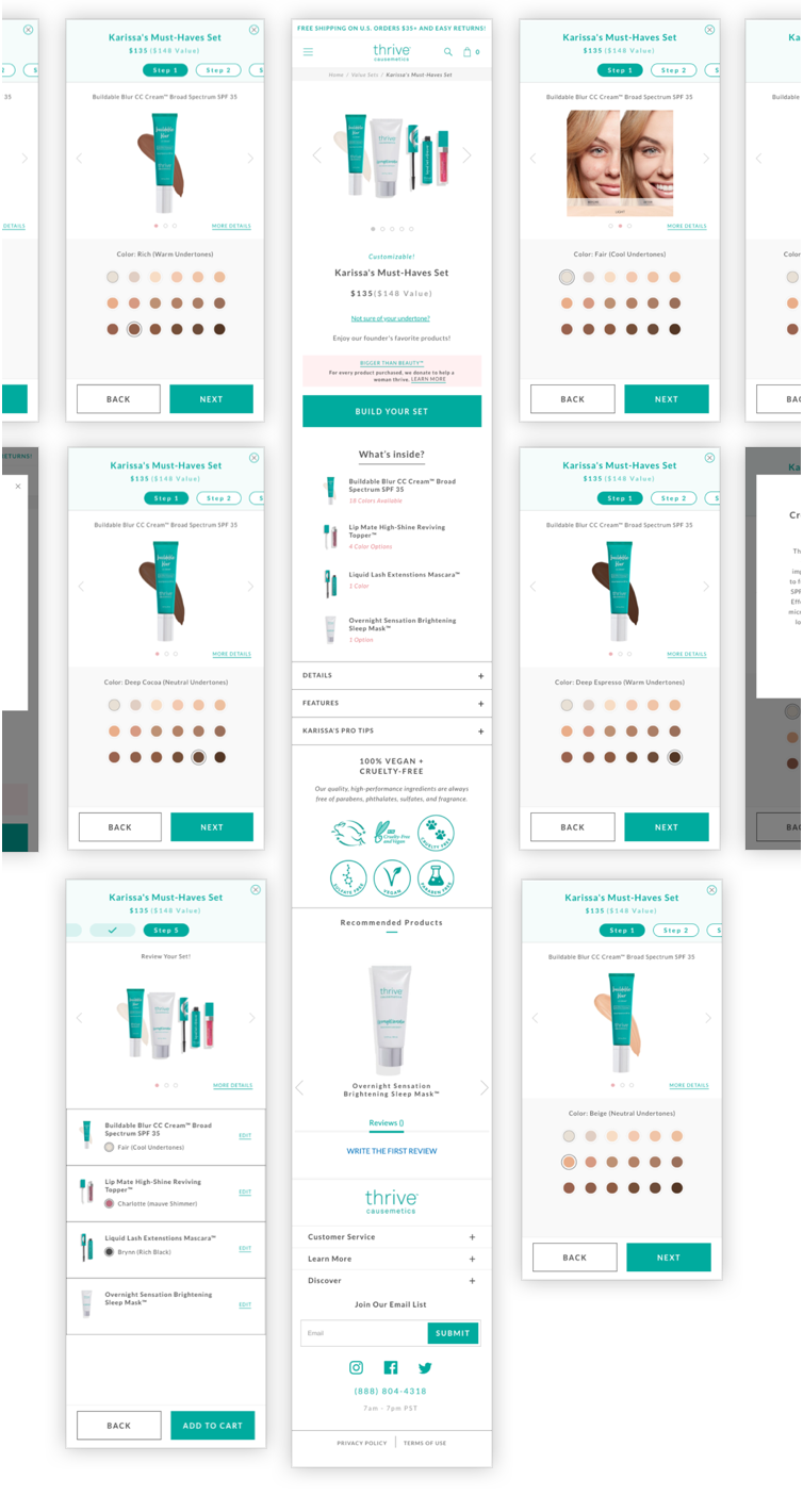
“Sets” are one of Thrive Causemetic’s product offerings where a predetermined selection of products are bundled together for a discounted rate. Users are able to select different colors/variants of products within the bundle when it is available.
Issue #1:
Due to the nature of how each “Set” is physically packaged, certain products and color combinations are unavailable. The Thrive Causemetics team asked us to better educate their users of this limitation and avoid any possible user frustrations.
Issue #2:
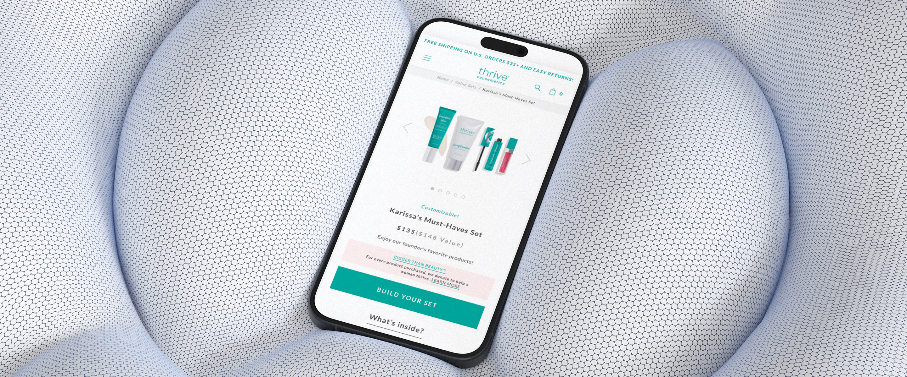
The new line of “Sets” may include more products within each bundle. If we simply added more products to the past design, we’d end up adding more height to an already tall mobile PDP (as seen below). Tall mobile designs have a known issue of causing users to frequently scroll up and down to obtain product information, which could lead to user fatigue and increased bounce rate.

Due to the height of the page on mobile, users were requried to (1) scroll up and down to see the product images when making a new color selection, and (2) scroll to learn more about each product within the Set.
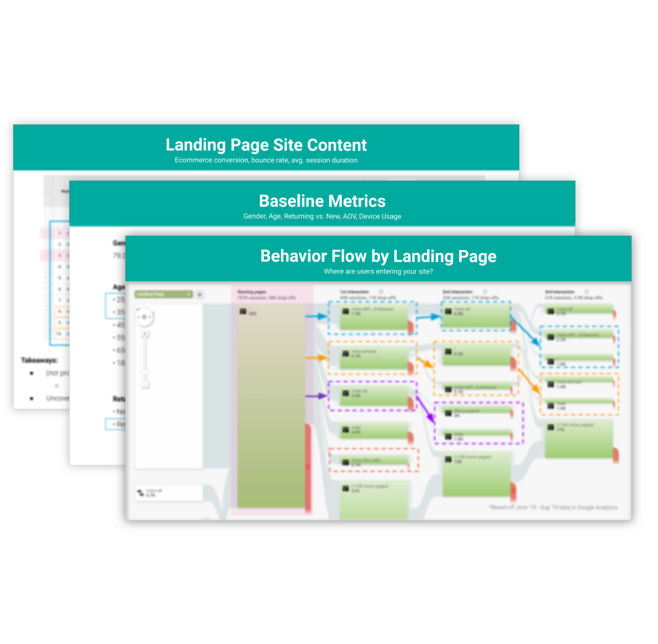
Looking into GA
Before any designs were started, my team and I wanted to better understand the Thrive Causemetics users and the current state of the Sets PDP. I used Google Analytics (GA) to gather some useful information, such as age, gender, device preference, landing page behavior, and bounce rates. Most notable were the high percentage of customers skewing towards a mobile female user.
With mobile being the preferred device for Thrive Causemetics, our team decided to focus on iterating and testing designs for mobile as the MVP.
Light UX Audit
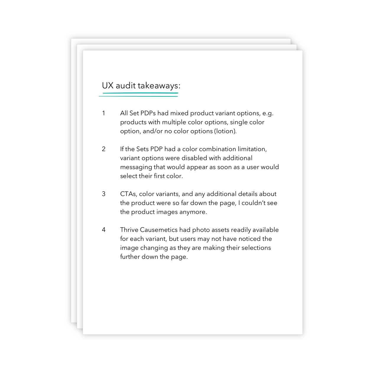
In addition to GA, I conducted a light user experience (UX) audit where I compiled all of the then current Sets PDPs, noted the limitations of product and color combinations, and went through the motion of purchasing each of the Sets to grasp what information was readily available to make a confident purchasing decision.
These notes and observations ultimately helped guide the project goals, design direction, and user testing parameters.
Project Goals*
*These goals were determined from direct client concerns, a UX audit, and an analysis of user traffic taken from Google Analytics.
1. Create a new “Set” experience where product information and adding to cart were still top priorities.
2. Educate users on what colors were available and for which product.
3. Allow users to view product images near their selection.
4. Design and test for mobile first.
Design Process
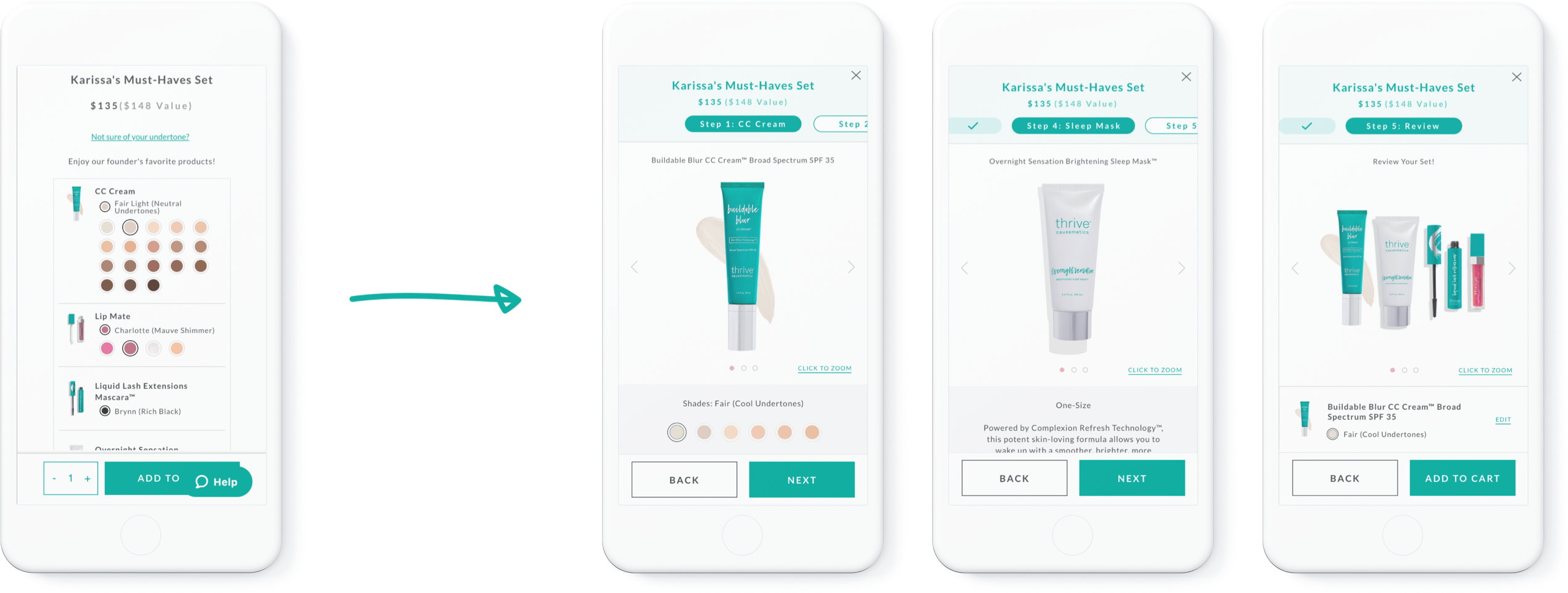
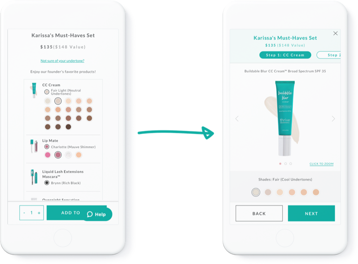
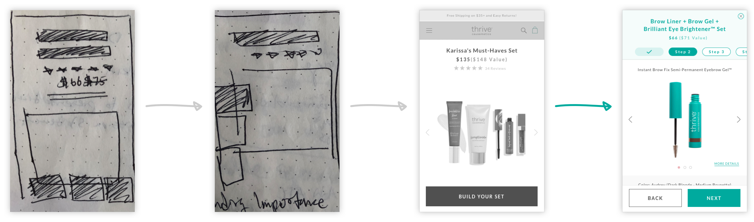
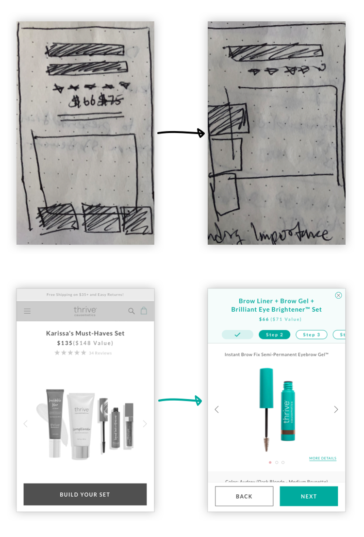
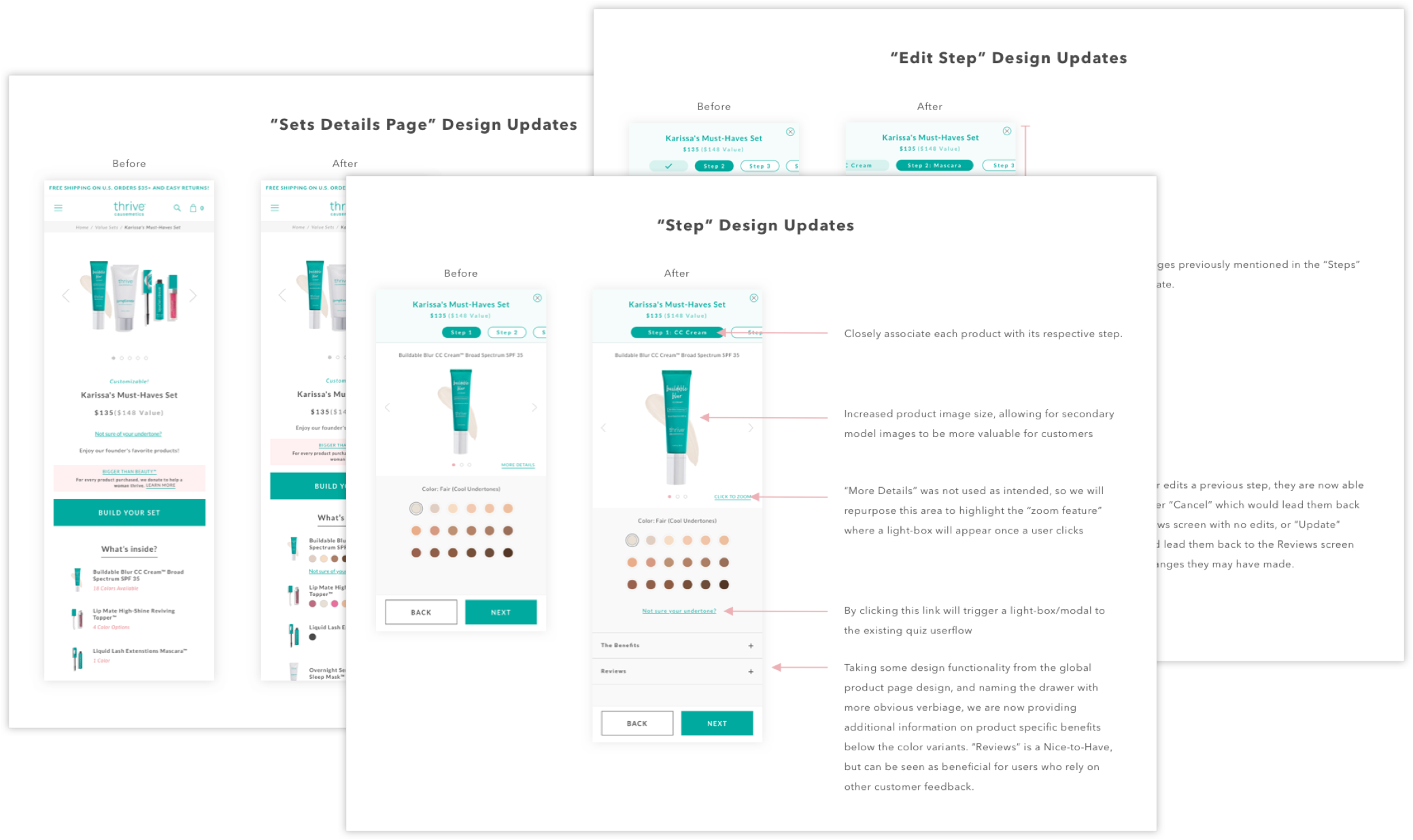
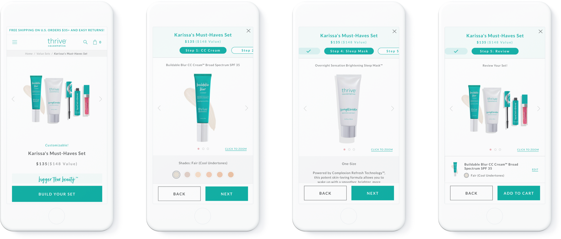
One of the main challenges of this project was creating a solution that presented all the necessary information without overwhelming the users. My early sketches tried to solve this problem by breaking up the variant selection process into tabs or carousels, but I could not avoid the issue of information overload on the PDP. Instead, I landed on a multiple screen design where one CTA on the PDP would start a user flow similar to a native app onboarding or quiz.
User-Testing
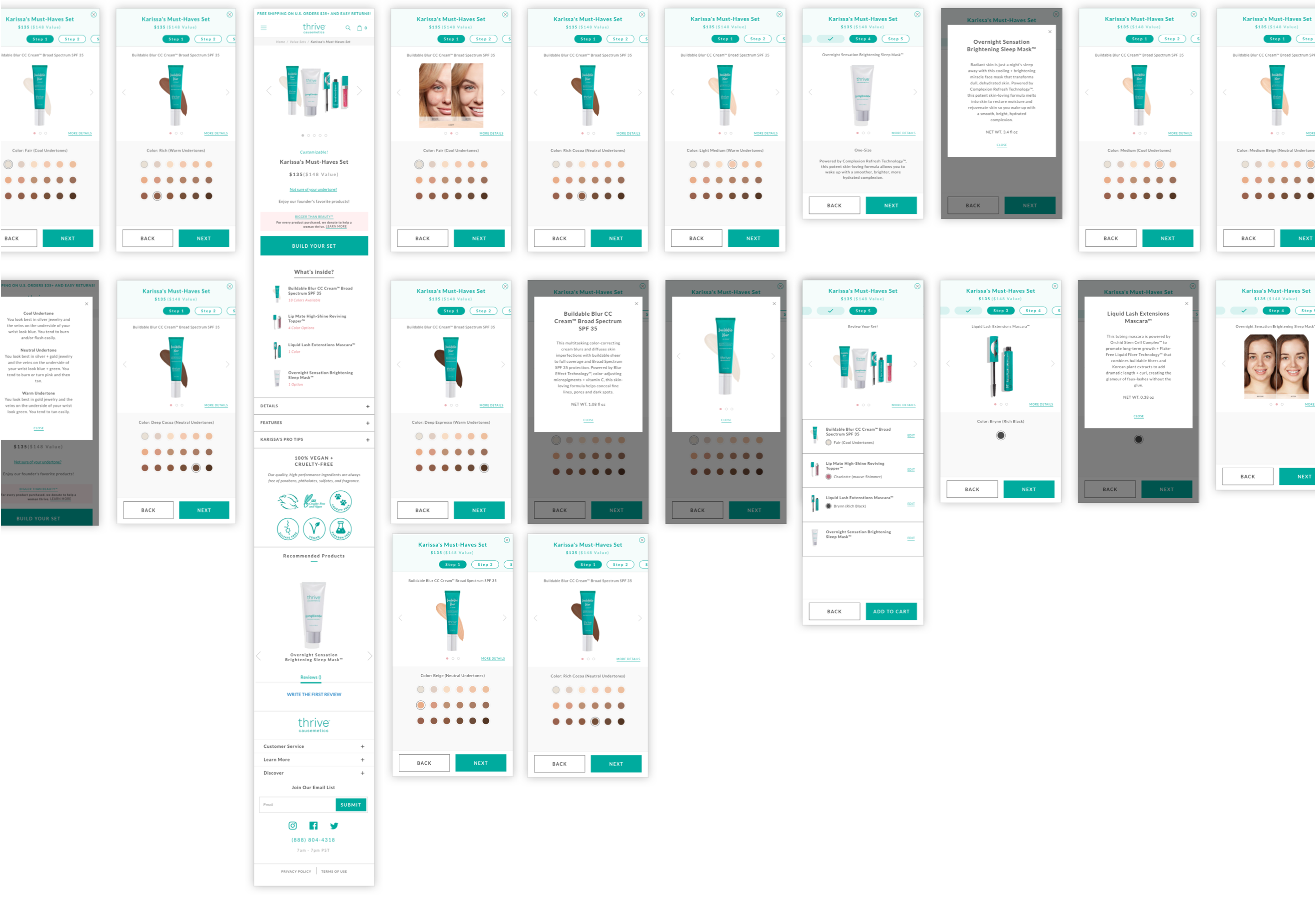
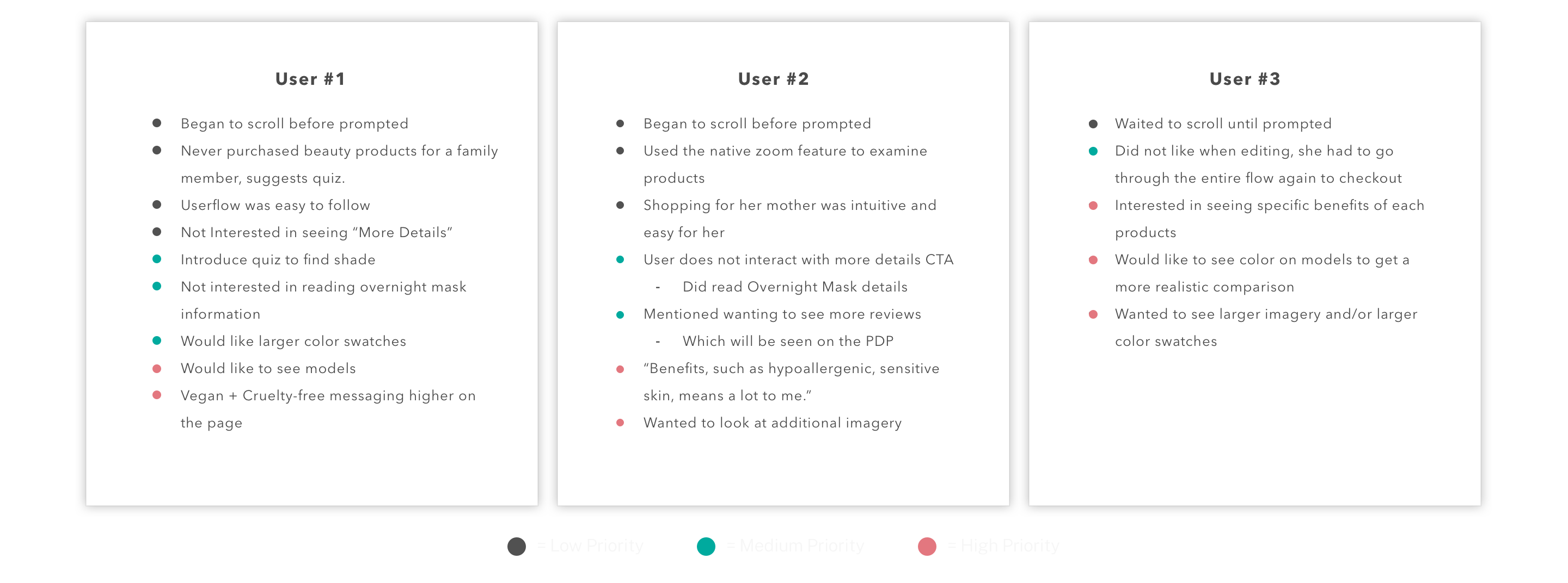
After a few rounds of design revisions and approvals, it was time to test the mobile user-interface (UI) design with the general public. I used InVision and userlytics.com to set up an unmoderated test with participants fitting Thrive Causemetic’s demographic. Our testers were asked to go through the purchasing flow of the “Karissa's Must-Haves Set,” because this particular set had all of the possible variant options: (1) a product with multiple color variants, (2) a product with only one color variant, and (3) a product with no color variant.
My approach to the user test was to observe how the testers interacted with the mobile UI, and also note what information they looked for and deemed important.
User-Feedback
Not only did our testers look for more information on each product, but they commented how the visuals and product benefits positively affected their willingness to purchase. Providing enough mobile real estate to successfully show product imagery and information was something we could not have done with the stacked design of the old PDP. By breaking the product selection process into steps, it provided that opportunity for discovery that users needed to confidently purchase.
Additionally, we found that users naturally chose the same color variant for the first and second product since that was the color that matched their skin tone. This was important to note since we had an initial concern of users becoming frustrated by the packaging color limitation. Even though that issue ended up being non-existent within our sample size (n=3), I recommended additional testing or monitoring of customer support to ensure that this was valid user behavior.
Final Design & Results
Once designs were approved, InVision links were sent to the development team and the new design was launched in 2020. For Thrive Causemetic’s top 10 customizable sets, they saw an increased eCommerce conversion rate of +44%!
Learnings
Test before testing...if you can
I started this project with a few client led concerns and opportunities of improvement. In addition to my GA analysis and a light UX audit, I felt comfortable moving forward with the design process. What was revealed to me through user testing were the assumptions we made to user-behavior earlier on, specifically with the packaging color limitation issue. I understand budgeting and time constraints are major factors, but if a project in the future allows for some version of early user-testing, I’m willing to suggest it in order to better understand the overall problem.
Credits
Agency
BVA
Year
2019/2020
Producer
Sean Glass
Senior Front-End Developer
Sam Webb
Front-End Developer
Elisa Ellis